Most gamers spend a lot of time thinking about refresh rate, resolution, and response time — and almost no time thinking about contrast. That’s a mistake. Contrast is the single setting that has the biggest impact on how your games actually look. It controls the gap between the darkest blacks and the brightest whites on your screen. and it is important to know the best Contrast Setting for Gaming Monitor. Get it right and games look rich, deep, and detailed. Get it wrong and you’re either losing shadow detail in dark corners or crushing bright scenes into a washed-out mess.
The frustrating part is that there’s no one universal number that works for every monitor. A 75% contrast setting on one panel behaves completely differently on another. Your room lighting, your panel type, and even what kind of games you play all factor into what the right contrast level actually is. This guide walks you through everything you need to know — from understanding what contrast actually does, to finding your ideal setting, to knowing when to adjust it for different situations.
What Contrast Actually Does (And Why It Matters for Gaming)
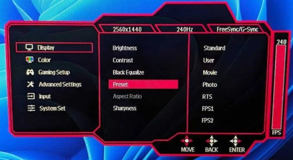
When you adjust the contrast slider in your monitor’s OSD (the on-screen menu you pull up with the buttons on the side or bottom of your monitor), you’re controlling the white level — how bright the brightest parts of the image can get relative to the darkest parts.
If the contrast is too high, the monitor tries to push the brightness beyond what the panel can actually display. The result is what’s called “clipping” — bright areas like a sunlit sky, a white wall, or a character’s clothing all merge into a single flat, featureless white. You lose all the detail in those highlights, and they just look blown out.
If contrast is set too low, the image looks flat and washed out. Colors lose punch, blacks look gray instead of black, and the whole picture feels dull and lifeless.
The sweet spot is where you can see full detail in both the brightest and darkest parts of an image simultaneously. That’s the goal, and it sounds simple — but getting there takes a bit of attention.
Static vs. Dynamic Contrast: Know the Difference Before You Touch Anything
Before adjusting anything, you need to understand the difference between static and dynamic contrast, as they are fundamentally different and should be treated as such.
Static contrast ratio is the real, fixed measurement of a panel’s contrast capability — the actual difference between the brightest white and the darkest black the screen can display simultaneously. This is the number that actually matters when comparing monitors. An IPS panel typically has a static contrast ratio of around 1,000:1. VA panels reach 3,000:1 to 5,000:1. OLED panels effectively have infinite contrast because black pixels simply turn off.
Dynamic contrast ratio is a feature in which the monitor automatically adjusts backlight brightness based on what’s on screen — dimming it when a dark scene is playing and cranking it up during bright scenes. Manufacturers love advertising absurdly high dynamic-contrast figures like 1,000,000:1, but those numbers are essentially meaningless in real-world use. Dynamic contrast makes your backlight pulse up and down constantly, which looks jarring during gameplay — especially during scenes that mix dark and bright elements, like a torch-lit cave entrance with sunlight streaming in from outside.
The verdict from virtually every display expert and calibration professional: turn dynamic contrast off. Leave it disabled. It can also add 4–8ms of input lag on some monitors as the display processing adjusts the backlight, which is the last thing competitive gamers need. Find the setting in your OSD (it may be labeled “DCR,” “Dynamic Contrast,” “Smart Contrast,” or “Contrast Enhancement”) and switch it off before adjusting anything else.
What Contrast Percentage Should You Actually Set?
Here’s what the research and expert calibration guides consistently agree on: most monitors perform best between 70% and 80% contrast, and the factory default — usually somewhere between 50% and 75% depending on the brand — is often already close to correct.
The key number to avoid is 100%. At maximum contrast, the vast majority of IPS and VA panels will clip highlights. Detail disappears from bright areas, whites look harsh and unnatural, and color accuracy suffers. Pushing contrast above 80% on most gaming monitors introduces a visible pink or yellow tint to what should be clean white areas. Meanwhile, dropping below 40–50% flattens midtones and makes the image look gray and lifeless.
As a practical starting point:
- IPS panels: Start at 70–75%
- VA panels: Start at 70–75% — VA naturally has stronger contrast, so you need less
- OLED panels: Many experts recommend leaving the contrast slider at its default on OLED monitors; the per-pixel dimming handles contrast intrinsically, and the OSD contrast slider on OLEDs primarily affects white level accuracy
How to Actually Find Your Monitor’s Best Contrast Setting
Reading numbers is useful, but the real-world method of setting contrast is straightforward and takes about five minutes. Here’s the process used by display calibrators and reviewed by monitor experts.
Step 1: Reset your monitor to factory defaults first. Go into your OSD and find the reset option. This gives you a clean, known starting point before you make any changes.
Step 2: Turn off everything that might interfere. Disable Dynamic Contrast, Eco Mode, Color Boost, Vivid Mode, and any other automatic picture enhancement. These adjust things on their own and make it impossible to calibrate reliably. Stay away from “FPS Mode,” “Racing Mode,” and similar presets — they typically oversaturate colors and artificially inflate sharpness, which looks aggressive but isn’t accurate.
Step 3: Set your picture mode to Standard or User mode. This unlocks all the individual settings including brightness and contrast. Other preset modes often lock out manual adjustments.
Step 4: Load a white level test pattern. You can find these easily by searching “monitor contrast test pattern” in Google Images, or visit websites like Lagom.nl that have dedicated monitor calibration test pages. A white level test pattern shows a series of near-white shades against a white background.
Step 5: Raise the contrast slider until the near-white shades start to merge into solid white — that’s where clipping begins. Then back it off slowly until you can clearly distinguish each shade again. That’s your upper limit. Most people find this happens around 75–80%.
Step 6: Test in an actual game. Load a game with a mix of bright outdoor areas and dark interior scenes. Check that you can see shadow detail in the dark corners while outdoor areas still look naturally bright. If bright areas look blown out, lower contrast by 5%. If dark areas look crushed and you can’t see anything in shadow, adjust brightness (not contrast) upward slightly.
Contrast Settings for Different Game Genres
What works well for an open-world RPG and what works well for a competitive shooter are slightly different things, and it’s worth knowing the distinction.
Competitive FPS games (CS2, Valorant, Apex Legends): Experienced competitive players often deliberately lower contrast slightly — bringing it down to around 60–65% — while raising brightness modestly. This reduces the depth of shadows, making it harder for enemies to hide in dark corners. Some monitors have a dedicated “Black Equalizer” or “Shadow Boost” feature that specifically brightens dark game areas without affecting the rest of the image. At the competitive level, visibility matters more than visual accuracy, and most pro players tune toward visibility.
Immersive single-player games (Elden Ring, The Witcher, Cyberpunk 2077): For atmospheric, story-driven games, you actually want deeper contrast. Shadows should feel genuinely dark. The image should have weight and depth. Sticking to the 75–80% contrast range gives these games the visual richness they were designed with. Many game developers calibrate their visual design at gamma 2.2 and a standard contrast level — playing near those values means you’re seeing the game as it was intended.
Horror and dark-scene-heavy games (Resident Evil, Alan Wake, Dead Space): These games depend heavily on tension from darkness. You don’t want to brighten shadows up so much that jump scares lose their impact. Keep contrast at your standard calibrated level and resist the urge to increase brightness to compensate. If dark scenes genuinely feel impenetrable, use the game’s built-in brightness calibration screen (most include one at startup) rather than adjusting your monitor.
Gamma: The Setting That Works Hand-in-Hand with Contrast
Gamma is a closely related setting that many gamers ignore, and it makes a significant difference to how contrast actually appears in games.
Gamma controls how your monitor distributes brightness between black and white across all the midtones in between. The standard setting is gamma 2.2, which is the global industry standard for Windows, sRGB content, and the vast majority of games. Game developers use gamma 2.2 as their reference point when building and lighting game environments, so setting your monitor to 2.2 means you see exactly what they intended.
Gamma 2.4 darkens midtones. It makes images feel more cinematic and atmospheric in a dim room, but it can make shadow detail harder to distinguish — opponents hiding in dark corners become invisible. For story games in a dark room, 2.4 can look gorgeous. For competitive games, it’s a disadvantage.
Gamma 2.0 or lower brightens midtones across the board. You can see into shadows more easily, which is useful for competitive play, but colors start to look washed out and the image loses depth and richness. Some competitive players use this deliberately, but for most gaming purposes, the image quality trade-off isn’t worth it.
For most gamers, gamma 2.2 is the right answer in most situations. If you play exclusively in a dark room and value atmosphere above all, try 2.4. If you’re a serious FPS player and want maximum shadow visibility, 2.0 is worth experimenting with.
Panel Type Affects Your Ideal Contrast Setting
Your monitor’s panel technology is a major factor in how the contrast slider actually behaves, and ignoring this leads to miscalibration.
On IPS panels, contrast is most sensitive around the 70–80% range. Pushing beyond 80% causes noticeable highlight clipping on most models. The relatively modest native contrast ratio (around 1,000:1) means the setting matters more — small adjustments are more visible.
On VA panels, the naturally high native contrast ratio (3,000:1 to 5,000:1) means the panel already has strong inherent contrast. You generally don’t need to push the contrast slider as high. Starting at 70% and adjusting downward if highlights look too intense is a good approach. VA panels also tend to handle shadow detail better at lower contrast settings than IPS.
On OLED panels (QD-OLED or WOLED), the infinite pixel-level contrast means the OSD contrast slider mostly controls white level accuracy rather than actual perceived contrast. Most display calibrators recommend leaving the OLED contrast slider at the factory default — usually 50% or wherever the monitor shipped — and adjusting only brightness to match your room’s ambient lighting level.
Brightness and Contrast: They Work Together
A common mistake is adjusting contrast when brightness is actually the problem, or vice versa. They’re connected, but they control different things.
Brightness controls black level — how dark the darkest parts of the image are. In most gaming monitors, it literally adjusts backlight intensity. Get this wrong and blacks look gray (too high) or the image is uncomfortably dark (too low).
Contrast controls white level — how bright the brightest parts get.
The correct order is always: set brightness first based on your room’s ambient lighting, then fine-tune contrast based on highlight detail. A generally practical brightness target for most gaming environments is somewhere between 120 and 200 nits of actual luminance — lower for dark rooms, higher for bright rooms with lots of ambient light.
If you chase contrast settings without first getting brightness right, everything you calibrate is built on an unstable foundation.
Quick Reference: Contrast Settings by Use Case
| Gaming Scenario | Recommended OSD Contrast | Notes |
| Competitive FPS | 60–65% | Prioritize shadow visibility; use Black Equalizer if available |
| Immersive single-player | 75–80% | Balanced accuracy and visual depth |
| Horror / atmospheric games | 75% | Don’t over-brighten; trust the game’s built-in calibration |
| General use / mixed gaming | 70–75% | The most reliable starting point for any monitor |
| OLED panel (any game) | Factory default | Don’t adjust; set brightness instead |
| HDR gaming (when HDR is active) | Leave at default | HDR bypasses OSD contrast; the game and HDR pipeline control it |
Final Thoughts
Contrast isn’t a set-it-and-forget-it slider. It deserves five minutes of your attention when you first set up a new monitor, and occasional revisiting when your gaming environment changes. The core rules are simple: start at 70–75%, avoid 100%, turn dynamic contrast off, set gamma to 2.2, and test in a real game before committing.
The right contrast setting won’t just make your games look better — it’ll make dark areas more readable, bright areas more natural, and the overall image more lifelike. For competitive players, it can genuinely improve how quickly you spot threats. For immersive gamers, it’s the difference between a game that feels like a window into another world and one that just looks like a flat screen.
It’s one of the simplest calibration steps you can take, and it costs nothing. Take the time to do it right.